Posted by Olivia dela Rosa on October 18, 2014
It is said that we eat not only with our plates but also with the eyes. Enjoyment of food is not just about taste anymore, and now the art of serving food has changed because of that.
A showcase of the world's best restaurant designs, branding and interior design.
For many food establishments, aside from the food being served on the table, they are also being scored based upon the whole dining experience: It all starts the moment a customer walks into the door until the time he takes the check. Indeed, great ambience along with excellent menu plus above par customer service and facilities altogether leave a lasting impression to the diner. But maybe there's another thing that people forget to consider when rating restaurants - and design has something to do with it.
Branding and marketing for food retail is often overlooked by some, but it has more impact to our psyche than we thought. In-store experience is something that can be controlled by the staff and crew of an establishment, but it's what customers take home with them from the experience and what they think of the restaurant once they are outside of its premises that create patrons and loyal followers of a certain brand. If food retailers and restaurants are creating winning brand along with amazing food, it will not be hard for them to expand their market.
Today we take you on a tour of the best restaurants and other food establishments that have scored big time both with their store design and branding. Here are 8 finds that have both appealed to our aesthetic taste and people's appetite. From the inspiring designs of their business cards, menus, posters and packaging, these brands are our proof that good food should be accompanied by good design.
Quick Tip: Looking for the best business card printing service? Read our review.
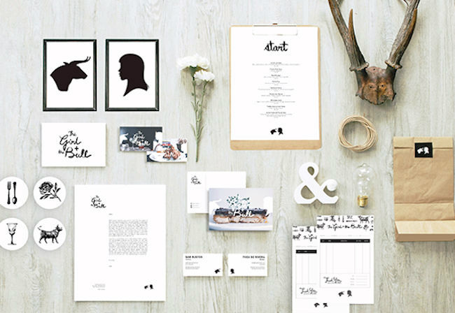
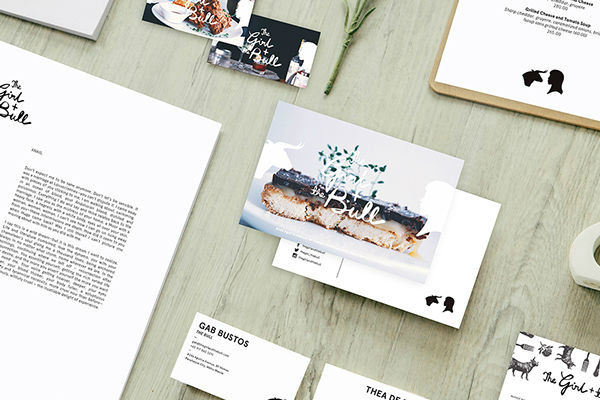
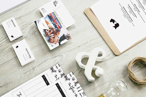
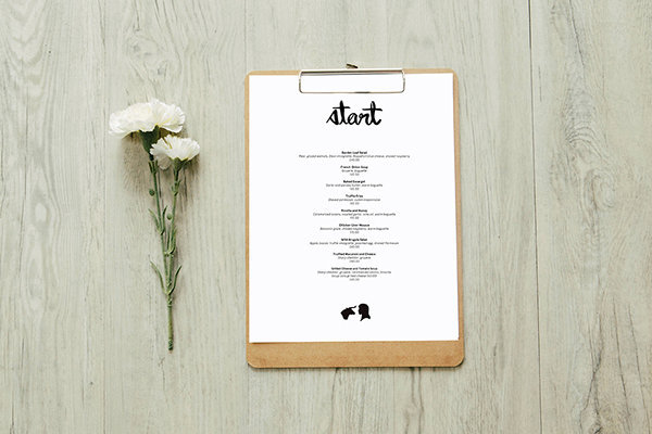
"This is a story we are all familiar with: Girl meets Bull, Bull charges at Girl, Girl tames Bull — or at least this is a story we want you to be familiar with. The brainchild of Gab Bustos and Thea de Rivera,
The Girl + The Bull is a reflection of their narrative."
A narrative indeed for these two. Located at the southern part of the city of Manila, TGATB has created sort of a cult following both among design enthusiasts and foodies. The place is brimming with photography, lucite chairs, books, and art pieces, creating an interior style that could pass off as baroque, and all corners of the restaurant is perfectly styled like the concept store that it is. As for the food, one of the award-winning food blogs in the Philippines Our Awesome Planet has this to say: "The Girl + The Bull is another noteworthy resto on Aguirre and is proof that 21-year olds can rock the resto scene with a comfort food concept that every foodie raves about. This is how real passion tastes on your plate." Not surprisingly, their business card and collaterals designed by creative agency Serious Studio stay true to their brand and serves as additional eye candy.
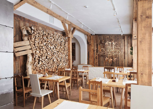
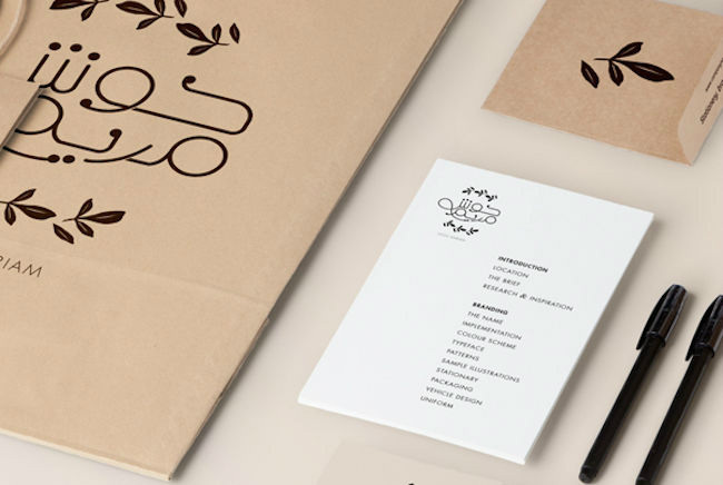
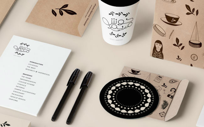
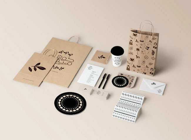
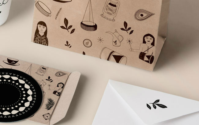
Cairo-based graphic designer Salma Shamel was tapped to come up with branding and collaterals for Hosh Mariam. Hosh Mariam is a new restaurant in Bahrain, and no further information can be found about the place except on Shamel's Behance page: 'Branding, illustrations and collaterals for a Bahraini restaurant. I was asked to focus on the communal concept of Bahraini courtyards and it’s activities, where families meet to dine, sing, celebrate and dance. Keeping in line with the focus and main idea, Hosh Mariam | حوش مريم resembles accessible Bahraini tradition. Hosh is widely known in the Gulf as the Arabic word for the courtyard, whilst Mariam is both a modern and old name common throughout the Arab region."
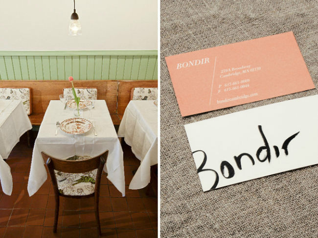
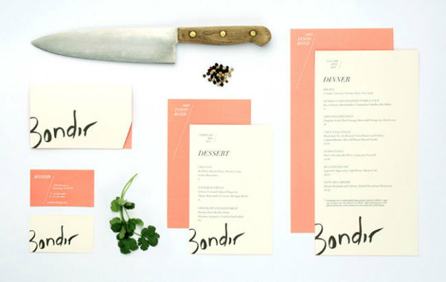
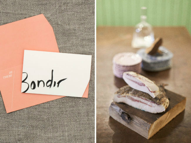
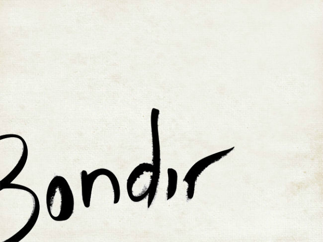
Bondir is a restaurant that is rooted from its owner's "root cellar" style of cuisine. Chef Jason Bond grew up in places such as Wyoming and Kansas, and has worked in various culinary environments and with passionate chefs just like himself. Jason's focus is on working to combine traditional techniques with modern ones for a more "honest", flavorful food, and this objective has been translated in his restaurant's branding as well.
The Cambridge, Massachusetts-based Bondir is known for serving fresh and high-quality vegetables, fish and meats on its menu (which changes everyday). For Bondir's branding, design studio Oat Creative came up with a salmon-hued theme that blends well with the farmhouse-style and feel of the dining hub.
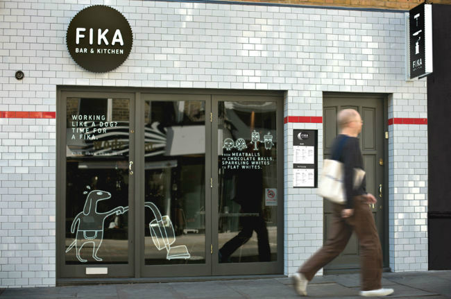
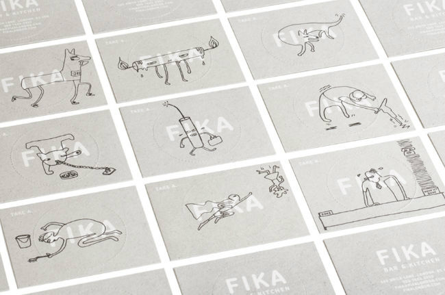
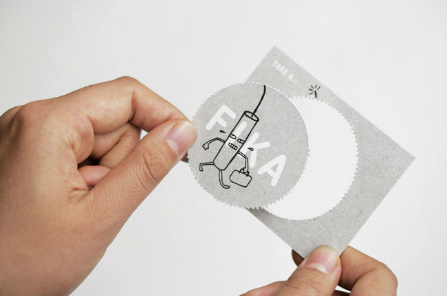
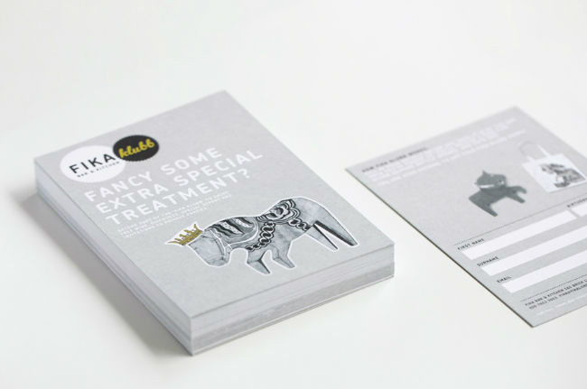
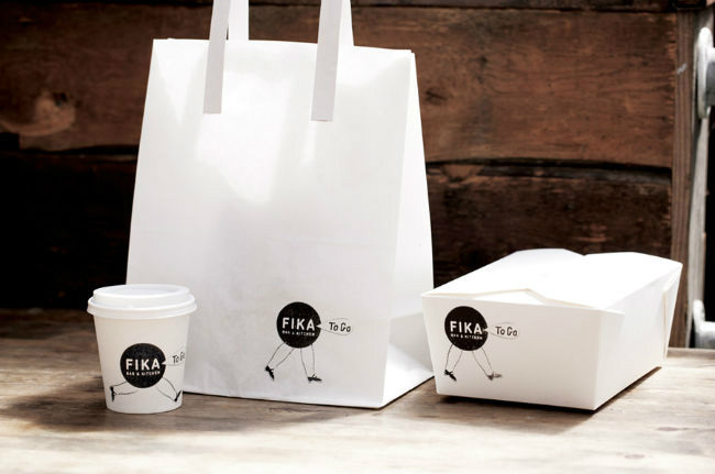
Situated along London's Brick Lane is Fika Bar & Kitchen. Fika serves an interesting menu, covering meals from brunch to dinner. Coffee and tea is served throughout the day, and there's always something for everyone from their choices of drinks. Apart from the menu though, the other thing that stands out is their visual identity - one that marries photographic elements to quirky illustrations and sketches on top of consistent logo and clever copy. With the help of creative agency Designers Anonymous for its branding, Fika easily wins anyone's attention and palate.
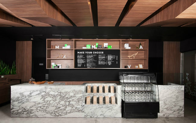
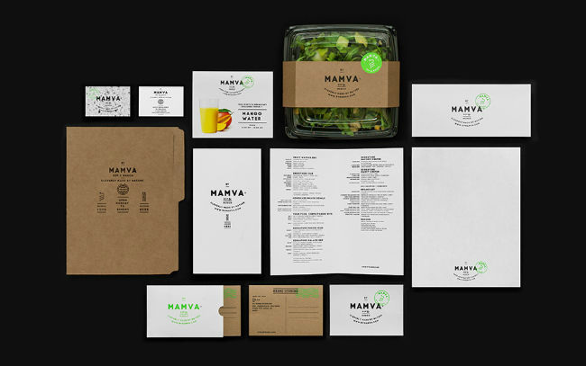
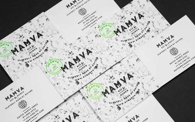
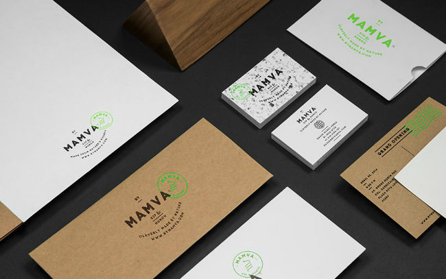
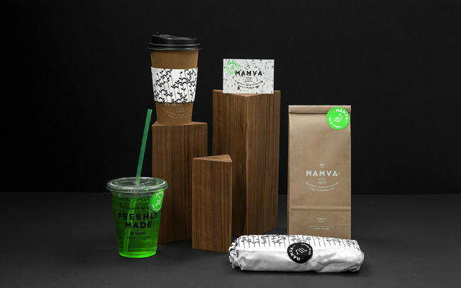
From the bustling city of London, we now go to Mexico and into the city of San Pedro Garza García to take a peek at Mamva. Mamva considers itself as a provider of healthy, natural meals and beverages. The interior design is an extension of Mamva's philosophy of giving only the best of natural ingredients in their menu - sticking only with materials such as wood, concrete, glass and marble to bring about an integral organic process that goes on inside the restaurant. Creative agency Anagrama translated that brand philosophy well into building Mamva's visual identity and collaterals, mirroring interior elements into print (just like the marble print business cards).
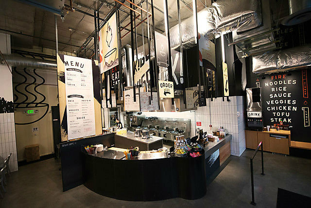
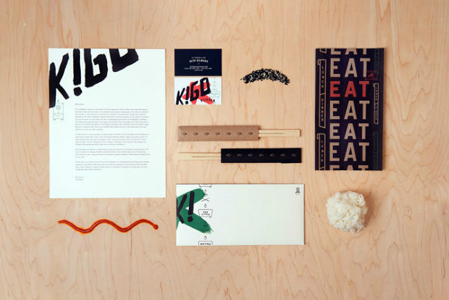
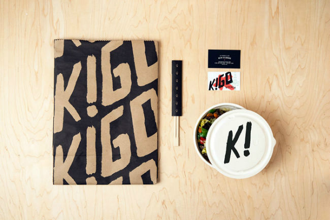
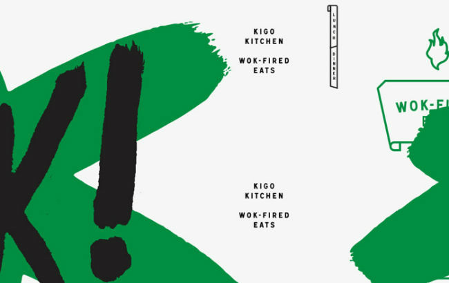
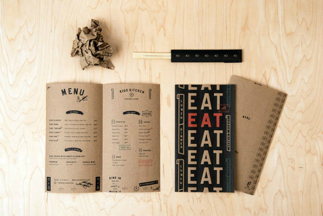
Kigo Kitchen is a Pan-Asian, quick-fire lunch and dinner joint that serves the cities of Boston and Seattle. The first word that comes to mind with Kigo is "bold", what with its open kitchen and mass of hanging signboards to its in-your-face logo. Design group Creature is the one responsible for the branding and identity for the restaurant, using large scale, brushed typefaces and illustrations contrasted by pops of color.
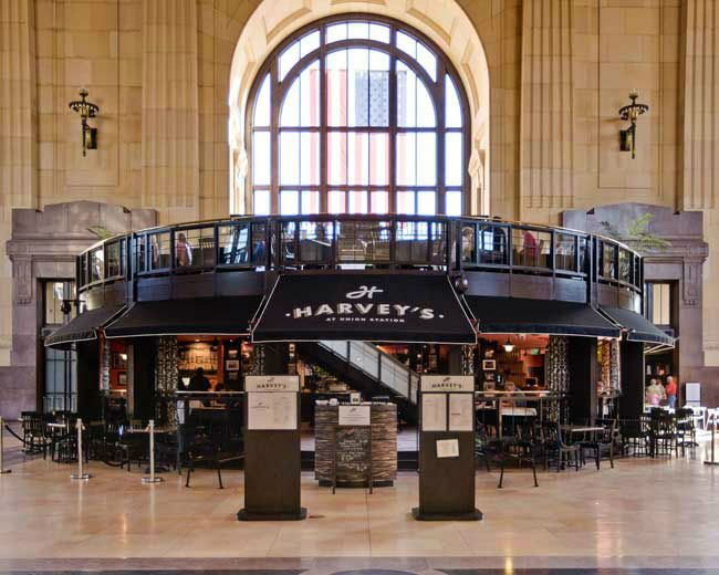
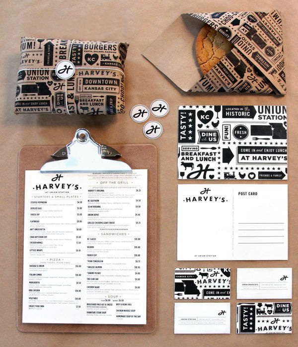
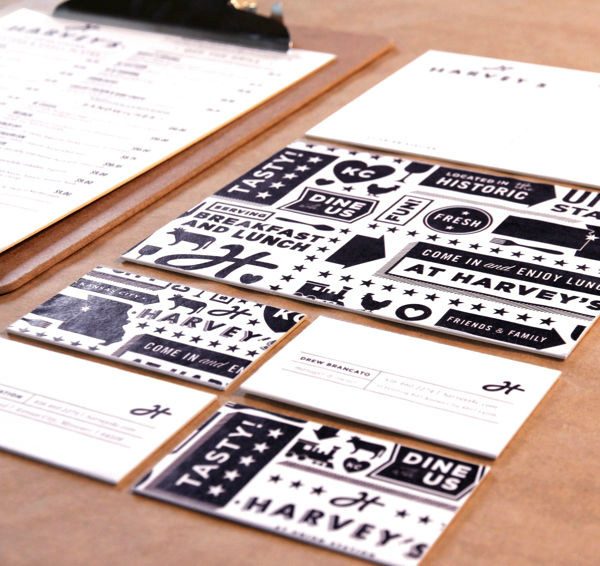
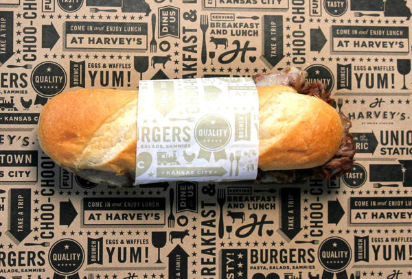
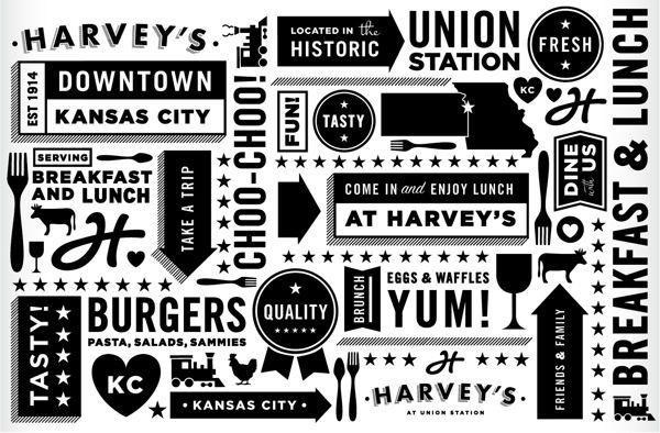
Harvey's has been around since 1914, making Kansas City its home ever since. It is strategically and comfortably situated inside the Grand Hall of the Union Station, welcoming potential diners upon leaving the train. Harvey's was originally Harvey House Diner but has been now transformed into the restaurant that it is now without taking out the classic diner feel. Tad Carpenter took that objective in mind and translated it into the visual identity and packaging they created for the restaurant.
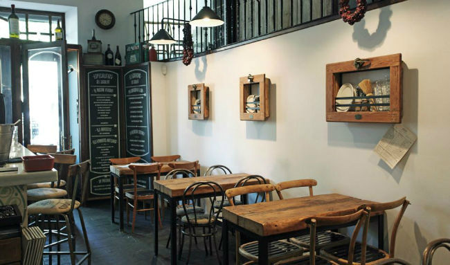
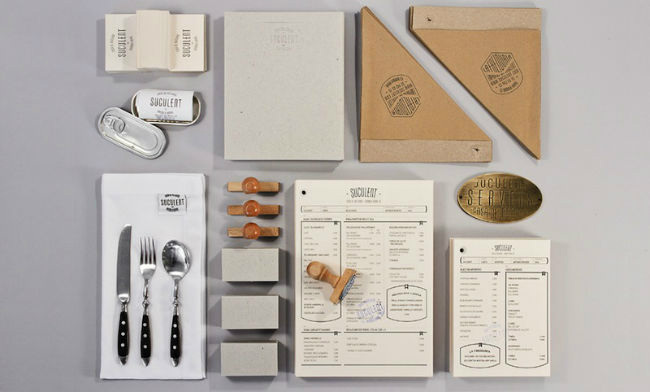
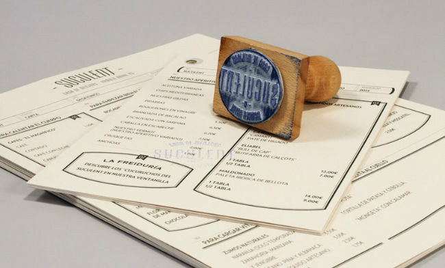
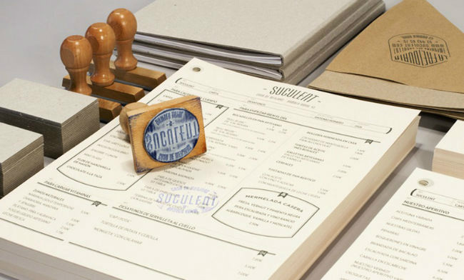
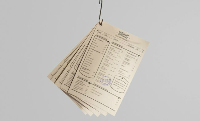
Suculent in Barcelona, Spain tags itself as the "house of homemade meals", boasting with history because of its location. According to its website, Suculent has been the home of Raval's Cellar in the past, which was frequented by workers and professionals over the last century (you've heard that right, century). Suculent retained the industrial-yet-homey vibe of the place but worked on using modern techniques when it comes to their cuisine. The branding done by Comité Studio was perfect in achieving that kind of identity for this establishment.
Just so you know, we have a comment box for a reason.
We are actively on the lookout for the best branding and graphic design here on the site. How about you - which restaurant comes to your mind in terms of good branding? Feel free to use the comment box below!
27 creative business card designs
Business card dimensions
High Tech Near Field Communication business cards
Im very frustrated with Cafepress. I tried to order online and spend more then an hour trying to get that order done: It was just impossibe!
I Finally ended up ordering by phone (and must admit the lady on the phone handeled it professional) still im very frustrated by their website.
 Rating: 2 / 5
I used to shop for personalized gifts at Cafepress, but tried InkGarden after reading your recommendation. Service and quality are wonderful and the prices are much better when you compare to Cafepress.
Thanks to you guys InkGarden is my new favorite online shop!
 Rating: 5 / 5
We used Overnightprints for our wedding invitation cards. The marriage was planned for a long time. Our initial plan was to celebrate it with a small circle of friends and family. Just 10 days before the wedding we finally decided to trow a huge party - you only marry once! Needless to say it was stressful to change things in the very last moment. We needed our wedding invitation cards FAST, read the review on overnight prints on this site and decided to use them for printing our invites. Everything turned out wonderful for us: The cards were delivered within 24 hours and the quality was wonderful. Overnight prints - for us - is a company you can count on.
 Rating: 5 / 5
Overnight Prints rocks when it comes to turnaround times and reliability!
It was Wednesday evening and i needed print material for a Friday evening event. I needed the prints to be ready and delivered to my office on Friday afternoon at the latest. None of the printing companies on this site were able to deliver this quickly, but Overnight Prints.
I did contact 2 local print shops as well - time wise they could schedule my prints to be delivered on time - but the price was 2 times higher compared to Overnight Prints.
Before i placed the order i contacted Overnight Prints over the phone, and they assured me they could meet the delivery time that was mentioned on their website.
After placing the order i read some negative reviews on Yelp about Overnight Prints, which made me very nervous and left me thinking i would seriously regret going with them.
Friday morning the prints were delivered at my office (11:00) and the quality was excellent! Just what i needed: good prints delivered on time.
I rarely use reviews on the web, but Overnight Prints saved my life on this-one. Thank you for that!
 Rating: 5 / 5
Many times you read negative reviews about companies online. I guess people do not take the trouble of leaving a good review when they are happy, so with the Christmas Spirit in mind i want to let everyone know that Printplace offers a great service and really nice print quality. I ordered posters from them and now im back for ordering Flyers.
 Rating: 5 / 5
