Posted by Olivia dela Rosa on November 04, 2014
The Process of Spot Gloss UV Printing explained and some great examples of Spot Gloss Finish Business Cards and Brochures
We’re always on the lookout for new, innovative ways that will change the game for the print design industry. But sometimes, the thing that catches our attention is the one that has already been around for some time. We’re talking about the beauty of printing with spot Gloss UV.
Spot UV or varnish happens to be one of the most popular techniques to increase the apeal of printing. Originally its purpose is to protect and cover the paper and ink, but because of its futuristic and glossy, sleek finish it is mainly applied to enhance the design and make it stand out.
Basically spot UV is a high-gloss liquid coating applied as a finish, after the print has been produced. It is a post-printing operation that can be done either online or after a while as the ink dries using a separate machine. You can consider using this finish depending on your design, the thickness of the paper (paper weight) you are using, and the details that you want to “highlight” in it. The UV part comes from the fact that this technique uses ultraviolet light to cure the glossy coating. The whole process can be actually quite simple to produce and also environmentally friendly, as the liquid coating does not contain solvents or give out volatile organic compounds after curing.
We love how spot UV can make even the dullest of designs look classy and sleek. For designs that are focused on typography or are trying to give a minimalistic feel, spot UV is perfect because of its accentuating effect. The partially coated element of the design catches light, giving it a strong contrast against the muted (matte) background. You’ll know what we’re talking about when you see our collection of print designs that got spot UV right. (Also, we have a surprise waiting at the end of this post so better to keep scrolling till the end.)
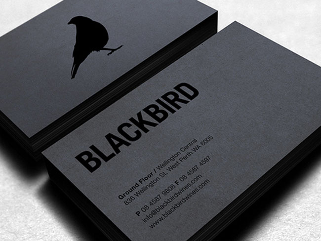
Blackbird via Tumblr
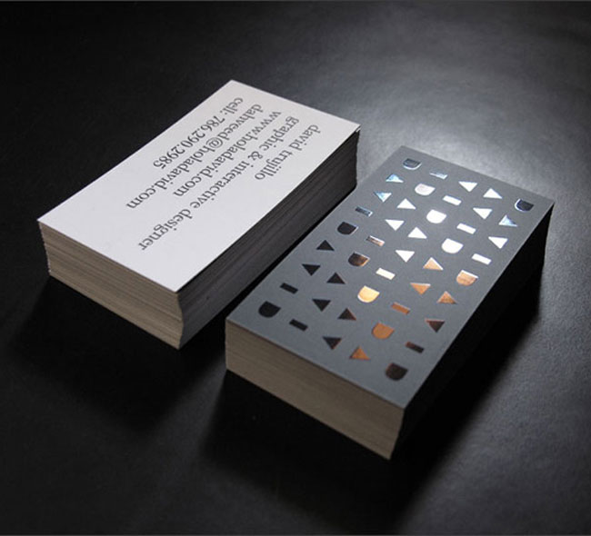
By David, for David. Self-promotional business cards by David Trujillo. Smart use of silk laminate, blind spot gloss and a hint of rainbow foil.
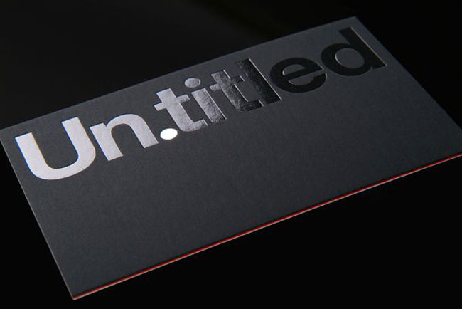
How about a bit of silver ... and red? Business card for Un.titled. Design took a minimalist approach with clear and matte silver foil, with just a hint of red foil sandwiched in the middle.
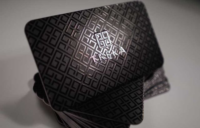
Black on Black Spot Gloss Business card by Cat 5iveprint
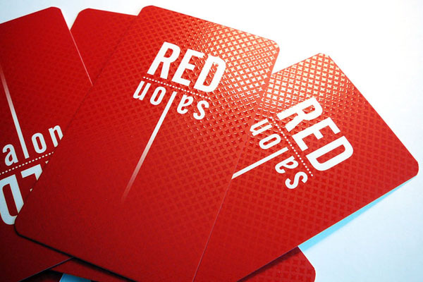
Red Gloss finish business card design by Printnex
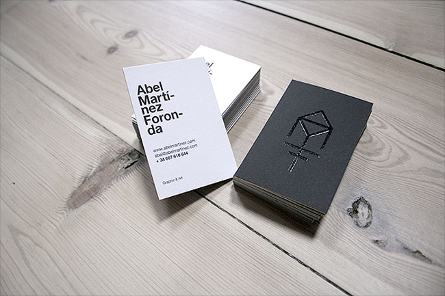
Black over white. Self-promotional business cards for Abel Martinez Foronda.
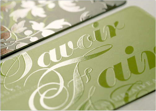
Savoir Faire business card design by Tasteofink
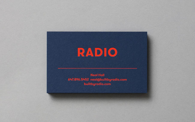
Blue card + red foil = classy. Business card for Radio designed by Tung.
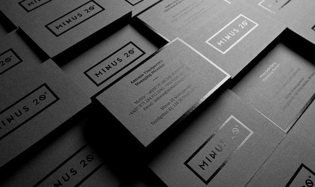
Bare and bold. These super sleek business cards for Minus 20 were designed by The Forgery.
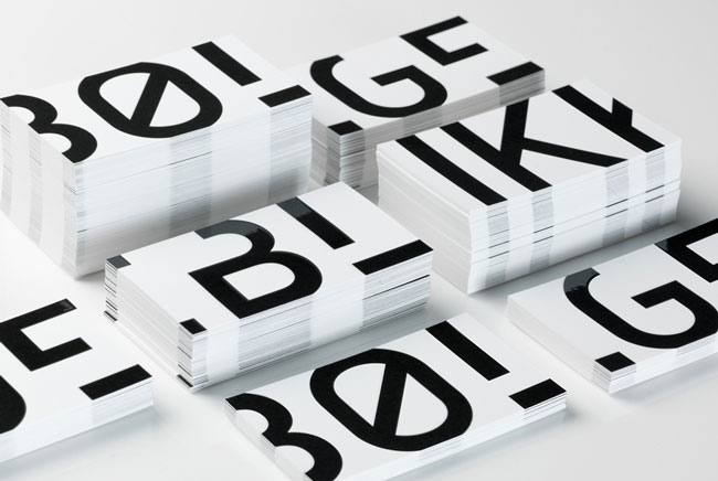
Oversized and UV coated font, yes, please. Bolgeblikk scored big on branding with these business cards designed by Oslo-based design studio Tank.
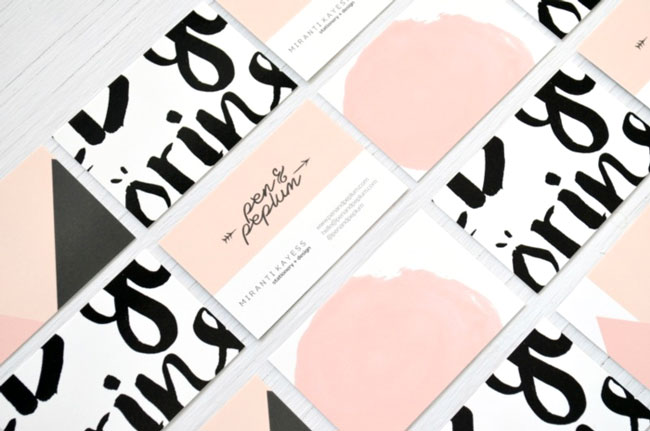
Redesign your brand with a dash of gloss. Pen & Peplum's business cards are just a perfect balance between the blog's distinct branding and minimalist design, enhanced by a gloss UV finish. With a little help from a friend in providing the official logo, Pen & Peplum's creator Miranti designed her blog's new business cards, brand board and thank you cards as part of the site's rebranding.
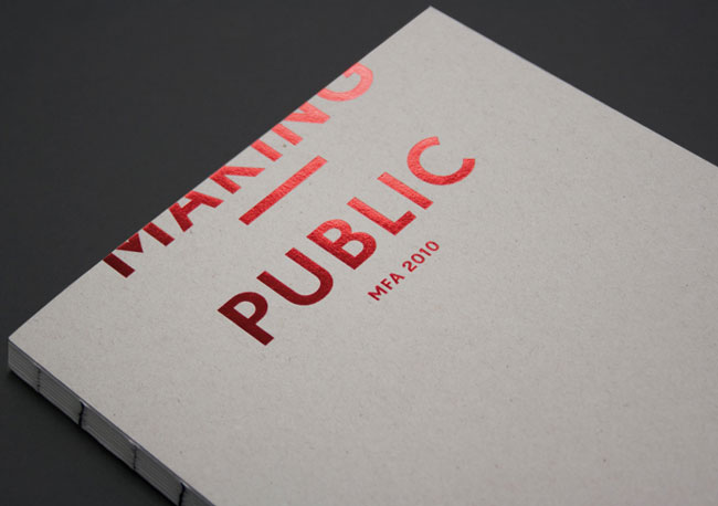
We're seeing red. This is the official catalogue for the art exhibition Making Public, as designed by HelloMe.
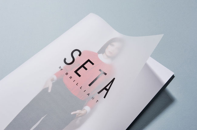
Tracing paper and a hint of gloss makes a good cover. SETA catalogue cover designed by Ivaylo Nedkov for FourPlusStudio.
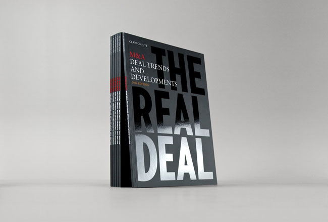
How company reports should be presented. Official annual M&A report of Clayton Utz designed by design agency BTP.
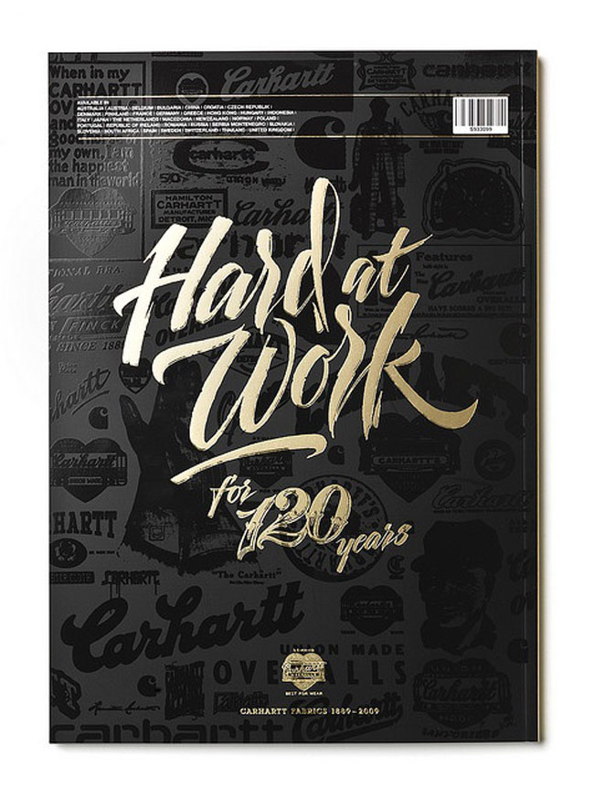
Gold label. Catalog cover for Carhartt.
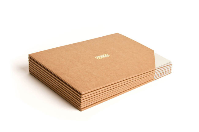
Nothing says luxury like gold. A piece from fashion label Honor's brand board and collaterals.
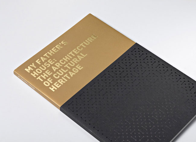
Another gold label over black. A hint of gold coating works on global brands, just like with this British Council exhibition catalogue.
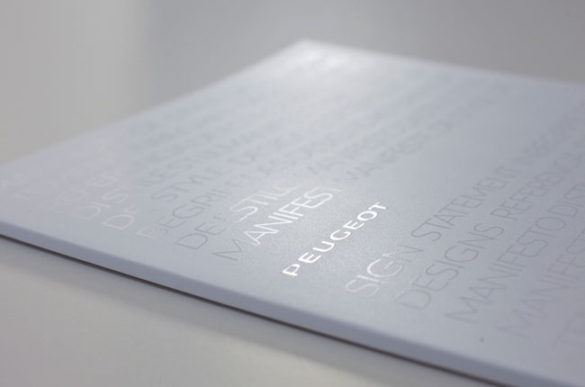
Cool, modern, strong. The monochromatic theme of this press kit finished off with spot UV gives off a truly modern feel for a brand like Peugeot.
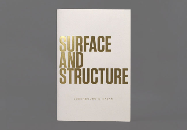
Nude, gold and gloss. A Watson & Company book design for Luxembourg & Dayan.
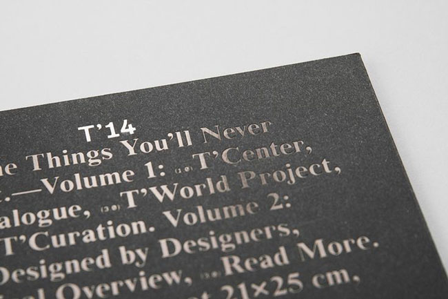
Will make you rethink your next catalogue design. A Think Work Observe-directed and designed catalogue for Tacchini Italia Forniture.
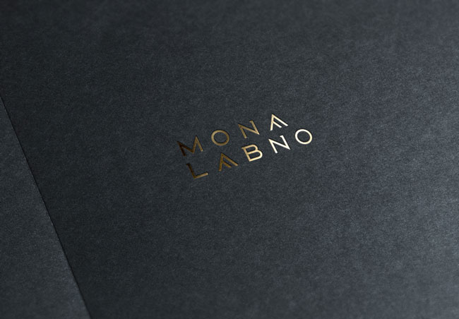
A Mona Labno wordmark designed by her husband Cris.
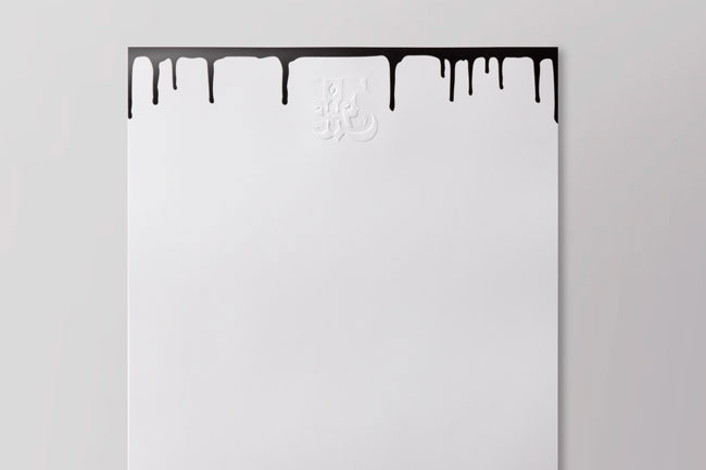
Something as simple as the letterpress design of these letterheads and comp slips can be spruced up with gloss UV coating, like the one for the printed black drips. Part of the visual identity for street artist Ben Eine designed by Root.
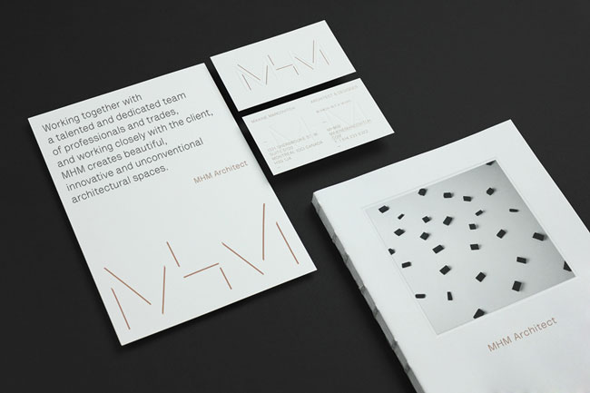
Blind emboss, metallic copper strokes and lots of white space. Perfect design for MHM Architects, as done by 26Lettres.
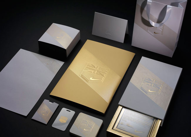
Intricate details of gold. Invitations and collateral design developed for Nike Olympic Hospitality Space during the 2012 Olympics by Darrin Crescenzi.
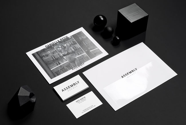
Blanc et noir. Assembly Agency got a new look, as duo d uo redeveloped the agency's visual branding.
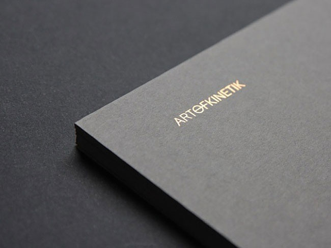
Only a certain type of visual identity will work for a brand that offers a range of super-luxury yachts like Art of Kinetik. Based on what we see, Kane and Associates did a really good job.
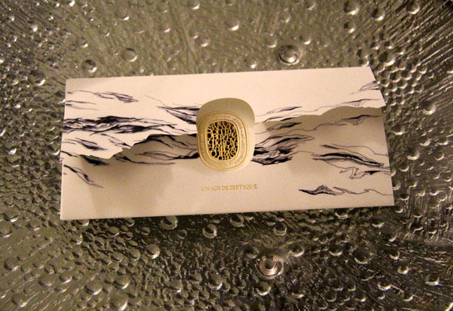
Beautiful card from Diptyque, a provider of French fragrance and solid perfumes.
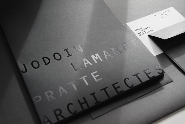
Jodoin Lamarre Pratte Architectes celebrated its 55th anniversary by tapping Paprika to redesign the architectural firm's branding.
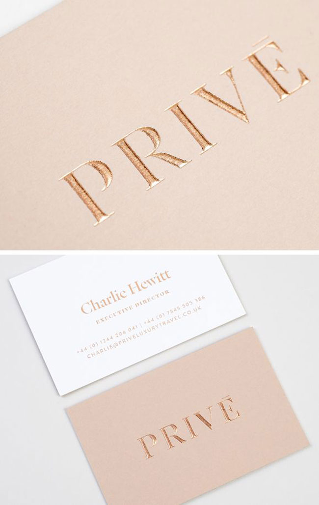
Using nude hues and foil blocked to perfection, these stationeries really suit a luxury brand like Privé
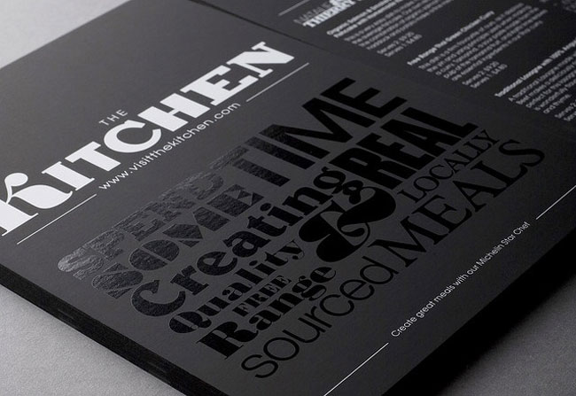
Design Friendship came up with this fancy flyer for The Kitchen.
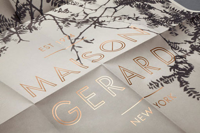
Classic yet modern for Maison Gerard. This high-end art deco furniture and objets d'arts store celebrated the launch of its new gallery showroom with collaterals designed by Mother New York.
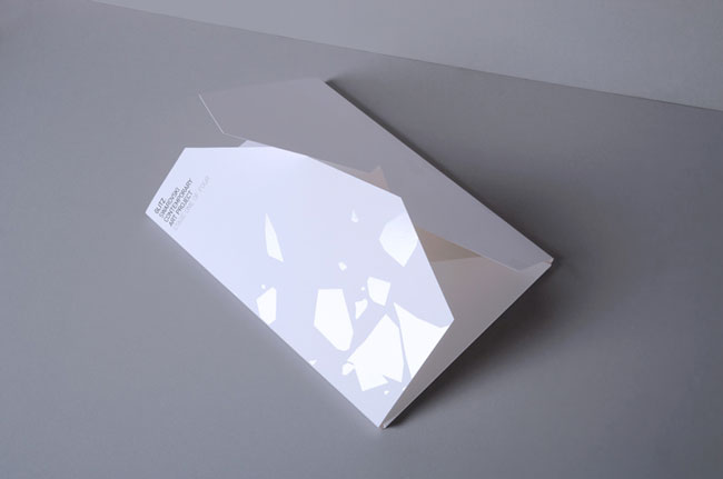
Work of art for this art project. Loving the subtle contrast from the white space and gloss. Glitz Contemporary Art Project collateral designed by Daniel Freytag.
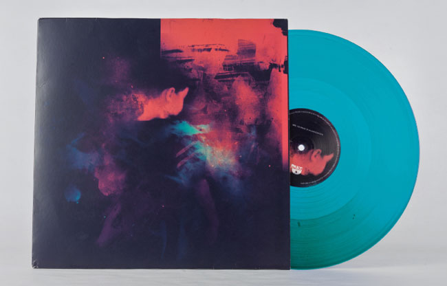
Vibrant colors, flattering texture. Project Mooncircle by Alfonso Cruz.
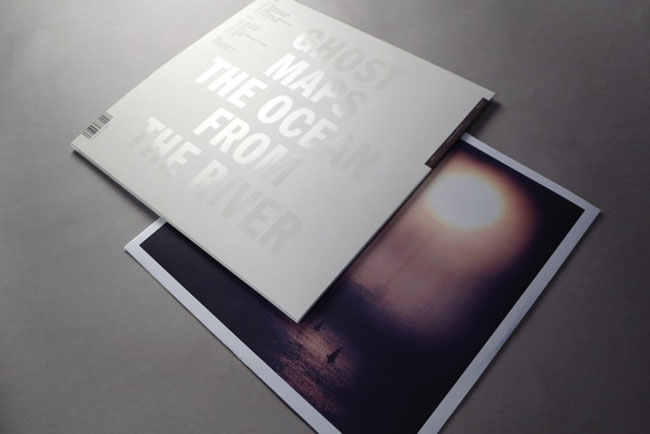
Dreamy, modern, Ghost Maps' The Ocean From The River designed by Oran Day and David Smith.
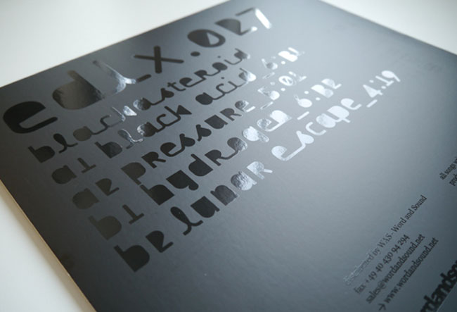
Black on black for this punk rock band. Electric Deluxe designed this record sleeve for Black Acid, along with the use of black matte/gloss finish and an indistinct typeface.
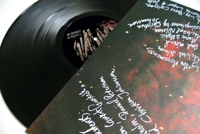
Eye candy. The reversible spot-varnished slip cover for the Like Elephants 1 & 2 LP by The Movements is a sight to behold, and there are only 300 copies of this that were issued.
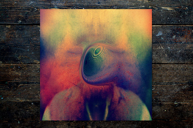
Cutting edge sleeve design. This one is a work of art for Young Magic's album Melt, and if you see the rest of Leif Podhajsky's body of work, you'll understand why we are amazed.
There are a lot of designs and variations that you can do when it comes to applying spot UV, and the good news is it's also relatively cheap.
Better news: Through our Coupons page, you can save almost half the price on spot gloss business cards. Overnight Prints currently offers a 48% OFF coupon when you buy any type of business cards, and you will get spot UV finish for free.
For a limited time, you get 500 business cards with spot gloss finish for only $29.05 - this really is a GREAT offer from Overnight Prints!
Great Letterpress Printing Examples
Popular printing methods
27 Great Business card idea's
Square Business card examples
Printingforless is my favorite online printer. Thanks for sharing these wonderful discounts!
 Rating: 5 / 5
Typical large company: it's impossible to speak to a human besides someone in a call-center who knows nothing about printing!! Result: crap useless business cards. Used vistaprint to save money: in the end it costed me money, time and aggravation.
 Rating: 2 / 5
Fist time ive tried vistaprint. They seemed to be a good option for photobooks, spend days creating and now i cannot upload. Been on call with their customers support for almost an hour now. I guess they are cheap for a reson.
 Rating: 3 / 5
I used to shop for personalized gifts at Cafepress, but tried InkGarden after reading your recommendation. Service and quality are wonderful and the prices are much better when you compare to Cafepress.
Thanks to you guys InkGarden is my new favorite online shop!
 Rating: 5 / 5
Using the holiday sale offer saved a nice amount on my holiday cards offer. Their quality was good, colours were vibrant and the stock was of good quality. Most importantly: delivery wa on time (2 days later) Like every year I was late with my order, so there wern't a lot of options to get my cards done in time. When i saw the offer from Overnight prints i took it, and looking back im glad i did.
 Rating: 5 / 5
