Posted by Pascal on September 01, 2014
Here is an illustrated guide of common printing mistakes and errors to avoid. This guide is aimed to inexperienced designers who want to create their own designs. Using this simple guide you will learn howto avoid disappointments and common mistakes that even the savviest graphic designer can fall prey to if they let their attention slip.
Knowing what to look for prior to sending your material to the printer can make the difference between a print job that looks great and one that winds up in the bottom of your recycle bin.
Quick Tip: Looking to get the best deal for your digital printing? Check out all deals, discount codes and promo offers of the large online printing services.
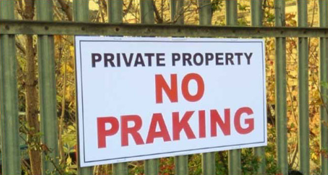
Always double check and make sure that there are no typos or grammatical errors on your job prior to printing.
Catching this error after an item has been printed is one of the the most frustrating mistakes to experience because it is has nothing to do with the printing process and everything to do with common sense.
Making spelling mistakes in your design is the one error that is easiest to avoid - all you need to do is read things through properly. Preferably let someone else proofread your prints before you send them to your favourite printing company.
Rik Haynes wrote an interesting post on how to avoid spelling errors on his blog.
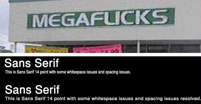
The above images are a good example on how the choice of fonts/ typography in your design will impact a print job's design. There are numerous examples of badly chosen fonts, if you are a graphic designer you are probably aware that picking the wrong one can and will make you the subject of mockery.
Avoid these mistakes and take into account its size, its color, it's background and the purpose of the end product that the letters will be printed upon. A font that is too small, too curly, or too difficult to read is simply not fit for public consumption, and most likely it will not get read at all.
As a rule, you will want to avoid using font size smaller than 8pt for print (smaller will be unreadable in print), typically use 16-18 point font size for commercial print as this is easily readable by all types on audiences. Also you want to limit the number of fonts you use in one design. Lastly, avoid fonts that feature fine lines, as they easily disappear depending on factors like font size and background color.
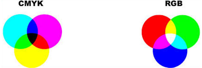
As a rule: If you are designing for color printing, always prepare your documents in CMYK mode.
RGB Color mode looks great onscreen and can be used for photography and website design but is not suitable for professional print.
In essence, RGB (also known as red, green, and blue color mode) utilizes light to mix colors. The more light that you add to a particular design, the more vibrant the color scheme gets. CMYK (also known as cyan, magenta, yellow and black (key) color mode) utilizes inks to mix their color schemes.
RGB color mode does have several advantages as it gives you a broader color palette to work with than CMYK, and it can produce a significantly brighter and livelier result.
However, there is a catch: RGB colors cannot be properly reproduced in print. If you use RGB colors for your prints, chances are big that you are going to end up with prints that are either dull and muted or you will find the colors/brightness of the print off. With RGB, the end result greatly depends on the printer driver/type of printer used, and you will see that RGB color documents turn out different on different (brand of) printers.
Therefore always make sure that your job is set to CMYK color mode prior to print.
Using CMYK will result in a significantly more accurate printed color scheme and print results will not depend on the printer's interpretation of RGB colors.
Quick Tip: When designing in Photoshop initially set your document in RGB color mode with color proofing turned on. Many Photoshop filters do not work in CMYK mode and performance is slower in CMYK mode.
When your design is finished, convert to CMYK mode for best print performance.
When designing an artwork for print job, set the resolution your document at at-least 300ppi.

Never use a (72ppi) image that you picked from the web as a basis for your print job - it will end up un-sharp.
Any graphic designers should know that screen resolution and print resolution are two separate beasts. The resolution that you see on your computer screen will determine how large or small your image will appear on screen. Conversely, the print resolution will determine how crisp and sharp the designs on your print job will appear. The biggest differentiation between the two entities is ppi, also known as pixels per inch.
Typically, the images that you see on-line are 72ppi. These will become very un-sharp when printing - the more pixels a printed image has, the greater the detail it will retain when it comes off the printer.
That is why in the world of print, the rule of thumb for almost any document is 300ppi resolution.
300ppi resolution is a guarantee for razor sharp prints, clear bright colors (CMYK) and great print quality for any product up-to A2 in size. Unless you aim to print very large sizes like billboards etc. there is no need to increase the resolution further then 300ppi.
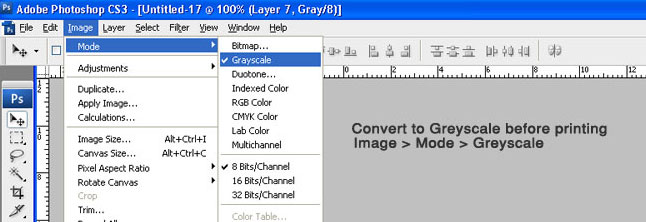
If you have a black and white design that you wish to use within a print job, you need to ensure that the document is either set up or converted to a working gray space or profile. If you do not do this, by default, the print job will add cyan, magenta, and yellow inks to the image when it gets printed.
Needless to say this makes the print job much more expensive, and you will not get the quality you aimed for. The reason for this is because there will be default cyan, magenta, and yellow colors set in their respective channels if you run your print job through a CYMK profile - unless you convert your document to greyscale first.
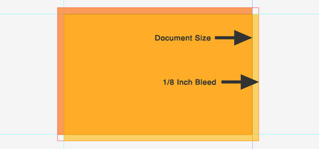
Bleed is a term that refers to artwork that goes past the boundaries of a document.
A proper bleed is one of the most important elements that a print job can have.
If you are printing flyers, business cards, brochures, or any other material that is not just a full printed page, you, or the printing company are going to need to use a guillotine to cut the paper to the size you want.
These guillotines are not exactly the most accurate devices, so having a bleed of around 1/8th of an inch around the print job will allow for slight trimming inaccuracies when they occur.
If you don't use a bleed, you can easily end up with either thin white strips of paper along the print's edge, or parts of your design will simply be cut off.
When designing for print you can use our resource page for standard sizes and select the correct dimensions to set-up your document.
Spoongraphics wrote a great post on how to setup bleed in Adobe Indesign, Photoshop and Illustrator.

GIF and PNG are for web design only - do not use them for print. More info on GIF & PNG at the W3C Website.
Avoid using .GIF and .PNG files in your print job at all costs.
They will not look good if you print them because neither file is designed for print. Gif and PNG files are specifically designed for use on the web and allow transparent backgrounds.
While they may look great on the web, their background will not show in print and the end result will look dotted. Another reason to avoid these file-types is their default resolution is 72ppi. As we just discussed, a printable image has to be set at least 300ppi in order to look good. You may be able to get away with printing GIF's and PNG files if you are using a small image, but you are better off not going down that road in the first place.
When designing for print we recommend using TIFF as preferred file format (for both MAC and PC).

A common mistake for non-professionals is the use of raster typography in their design. Using pixel based (raster) text will end up in un-sharp edges when printed. If you want to print your design with razor sharp typography always try to use vector typography and vector based graphics.
A properly formatted vector graphic can go as big as you want it and will always look perfect.
Unfortunately it is not always possible to use vector typography, for example if your design is based on a (raster) image or photograph. In this case make sure you set your document's resolution to at-least 300ppi and do not print any larger then A2 size.
There is a tutorial on how-to convert raster graphics to vector in Photoshop here.

Never give a green light on a print job without producing a ( in house) proof first.
Doing so will minimize the gap that may separate what you want it to look like and what might actually be produced. Not producing a few proofs to make sure everyone is on the same page could turn into a very pricey print job. This is especially important if you are planning to do a large-scale or a time critical print job.

There is no need to explain why the above image is an example of bad taste in design.
Almost any print job will be an extension of who you are as a business entity. If you create something that looks tacky, weird, or just plain awful, you will be leaving a like-minded impression with your current and future clientèle.
If you don't have much design experience, take the time and do a little research on how to create a winning print job.
There is a wealth of quality resources that you can utilize in order to get a basic grasp on the kinds of concepts that work and the kinds of concepts that will fail miserably. There are also plenty of places around the Internet that allow you to showcase your design to the masses prior to print, so you can get both positive and negative feedback.
If you take note of the above tips and get comfortable with how a job makes its journey from the design stage to the printing press, you will find that creating a stellar print job does not have to be a difficult process at all.
Business Card related offers and links:
» Best Business Card printing companies reviewed.
» Inspirational Business Card designs.
» Business card design idea's
I use Overnight Prints to get my business out there. Bookmarks, calendars, flyers and business cards are just some of the items I ordered in the last year. I came to this site looking for a coupon to order a iPhone case, but looks like they are not available yet.When will they be available?
Anyway, if you want great quality at great prices, give them a try!
 Rating: 5 / 5
Printingforless is my favorite online printer. Thanks for sharing these wonderful discounts!
 Rating: 5 / 5
Typical large company: it's impossible to speak to a human besides someone in a call-center who knows nothing about printing!! Result: crap useless business cards. Used vistaprint to save money: in the end it costed me money, time and aggravation.
 Rating: 2 / 5
I received my business card order this morning, quite some days sooner than my order tracker emails said they would arrive and honestly i do not remember ever being this impressed by a product i ordered online.
Well done Moo... The whole experience with you was great: how everything was packaged, the quality, the service, the site. Everything. Super super super.
 Rating: 5 / 5
I prefer Print Place over any other printing company and have been using them for years. They are my one stop shop for any printing job. Service level is wonderful, product quality excellent. The only negative i can think of are their outrageous shipping rates if you order multiple products. They really need to fix that.
 Rating: 4 / 5
